Simon Griffee
Department of graphic design, art direction, and photography.
Websites
A few websites I have made in the past.
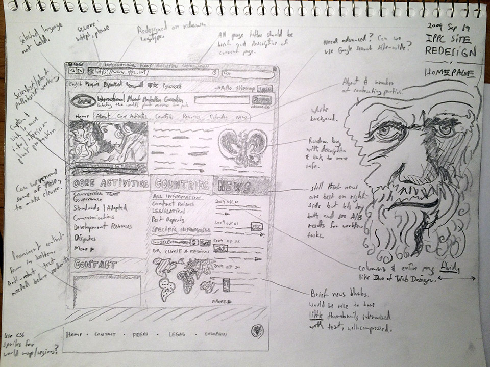
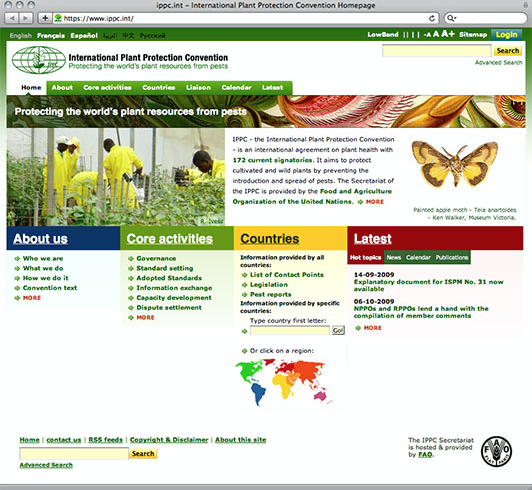
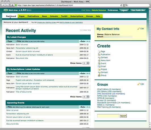
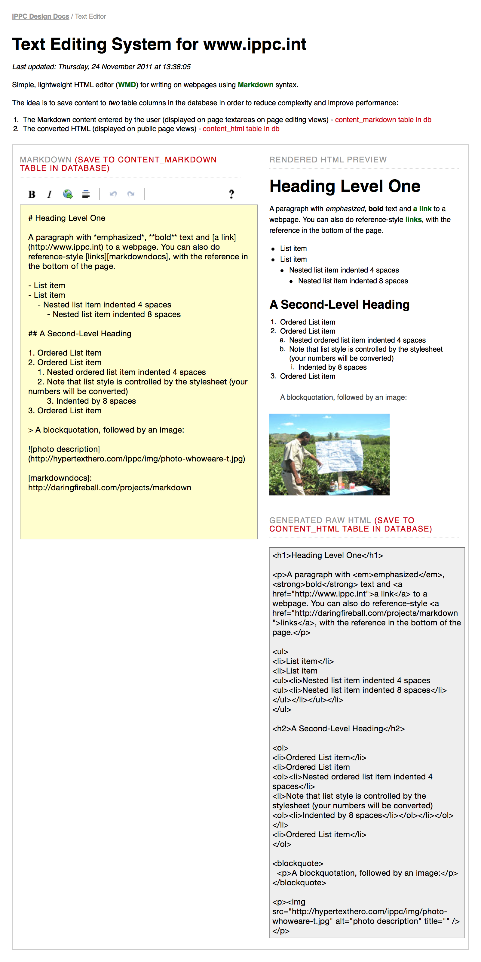
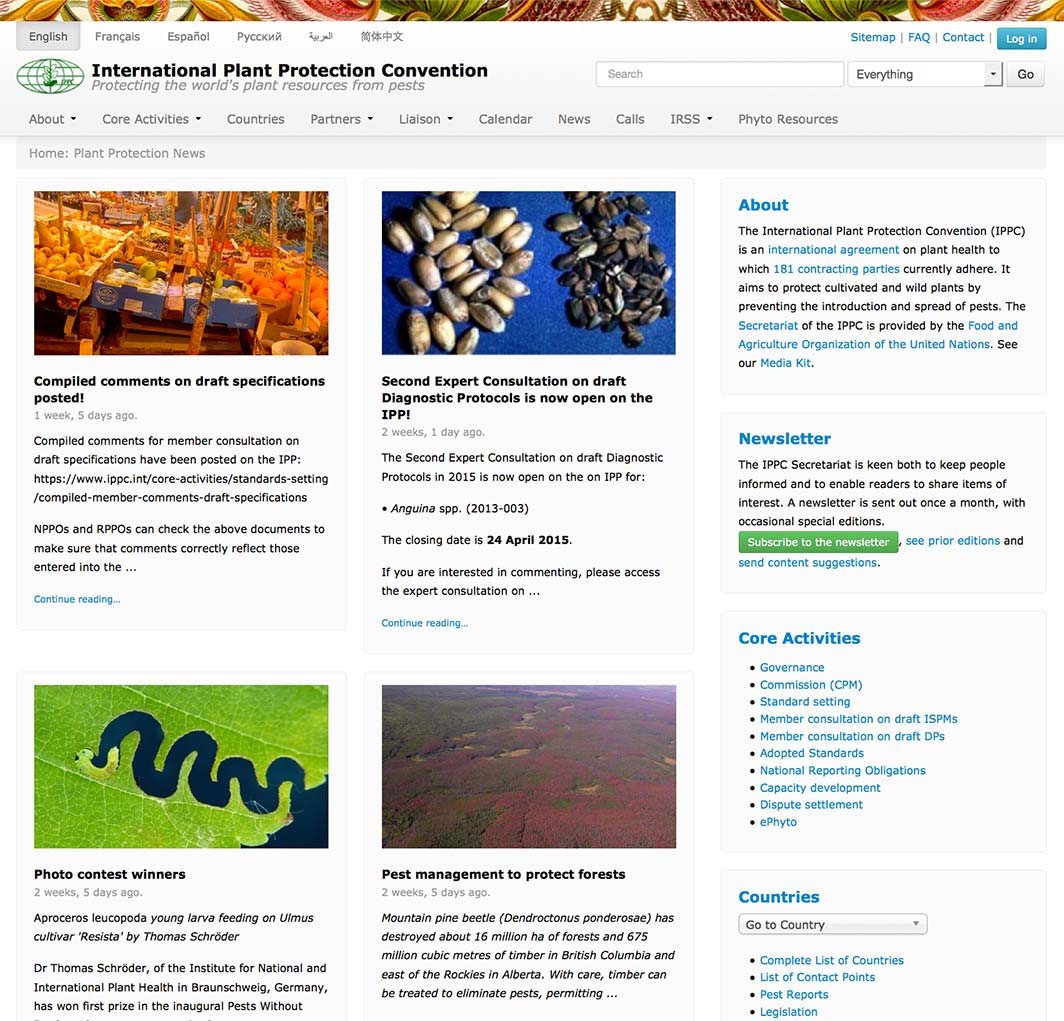
Sketch of the homepage with a drawing of Darwin who I imagined at the time would be a potential user of the site if he were alive. Homepage. Admin page. Text editing system. Design documentation page example. Latest version (2015), built with Django and Mezzanine CMS. |
International Plant Protection ConventionUser experience design, graphic and identity design, HTML markup, CSS, JavaScript, user testing, debugging. The IPPC is an international agreement on plant health to protect cultivated and wild plants by preventing the introduction and spread of pests. ProblemThe existing IPPC site contained a wealth of information which was difficult to access in an unclear hierarchy. Navigation was difficult for visitors, content updates were complex for staff and the site lacked a visual voice. SolutionI worked with IPPC staff to produce a new www.ippc.int design based on web standards. A design process was carried out which consisted of the following:
After the IPPC’s main audiences were identified the information architecture was drawn out and a wireframe prototype was created which allowed direct use in a browser and better initial feedback. A visual design was chosen from a series of mockups which were presented to the IPPC Secretariat. Site elements were separated into clean code consisting of semantic HTML for content, CSS for layout and visual presentation and JavaScript for accessibility-enhancing behaviors such as text-resizing. Page templates using this code were produced for the IPPC programmer to implement. I then created a custom backend administration interface design for the website which makes management and updates much easier for IPPC and countries’ staff to use. User testing was carried out with www.ippc.int audience members and staff and modifications were made based on test results before, during and after the new site launch to identify and resolve problems. Throughout the project I worked closely with IPPC staff both remotely and in the Food and Agriculture Organization offices which I eventually joined as a staff member. Work DoneUser experience design, graphic and identity design, HTML markup, CSS, JavaScript, user testing, debugging. See also:
|
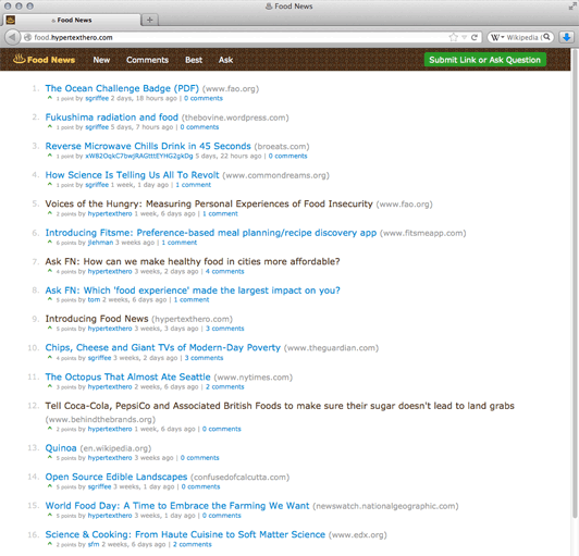

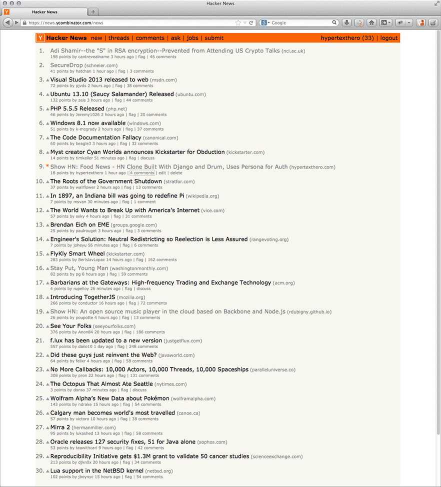
Food News on the Hacker News front page. Below is the blog post announcing the project. ♨ Food News is a website to publish and discuss links about healthy sustainable food, ranked by readers. It uses Mozilla Persona for authentication and no passwords are transmitted to or saved on the food.hypertexthero.com server.1 The code is open source. Links on the homepage are ranked using a time-scaled ranking algorithm. This means that both the time since a link was published (its age) and the amount of up-votes a link has received (its popularity) affect a link’s rating, so fresh, interesting links should be present on the homepage every day, especially if the site becomes popular. I.e. The homepage lists the most recent links with most votes, while the New page lists the most recently posted links. People publishing on Food News have a ‘karma’ number, which is a measure of their reputation on the site. Karma increases when a person’s links or comments are up-voted. Recent comments with most upvotes are listed in Best. Ideally, food lovers, as well as people with knowledge in food-related sciences and disciplines such as agriculture, animal health, biodiversity, climate, forestry, gender, plant protection, land tenure, nutrition, soils, water, etcetera, would use Food News to publish links and comments with good information about food to help us develop better eating habits that are less damaging to our planet and the species living on it, including us humans! Note that links to not-for-profit endeavours are preferred and that spam will be deleted. Thanks to Stephen McDonald for Mezzanine and Drum, upon which Food News is built, and to Michael Kelly for help with a django-browserid issue. Comments, criticisms and suggestions are welcome at the Hacker News thread! —Simon
|
Food NewsWeb Application Hacking, Python, Django, HTML, CSS, JavaScript, Graphic Design. ProblemNo problem. I wanted to see if I could create a Hacker News clone with Mozilla Persona for authentication. I had already made two attempts at this type of web application, one for Rome links and stories and another for a zombie apocalypse game called Day Z, so I thought I’d do one for food while working at the Food and Agriculture Organization. SolutionI hacked together food.hypertexthero.com building upon the work of Stephen McDonald’s Drum, which was itself built upon his own excellent Mezzanine content management system. Food News was the first thing I made that appeared on the front page of Hacker News, which was exciting for me! Work DoneWeb application hacking (Python, Django), HTML, CSS, JavaScript and graphic design. The ♨ glyph in the logotype is Unicode character ‘Hot Springs’ (U+2668) in the Miscellaneous Symbols Unicode block (2600-26FF), which I am using in the text above. For the Food News site, I made a PNG image of it for reliable rendering across browsers. |
|
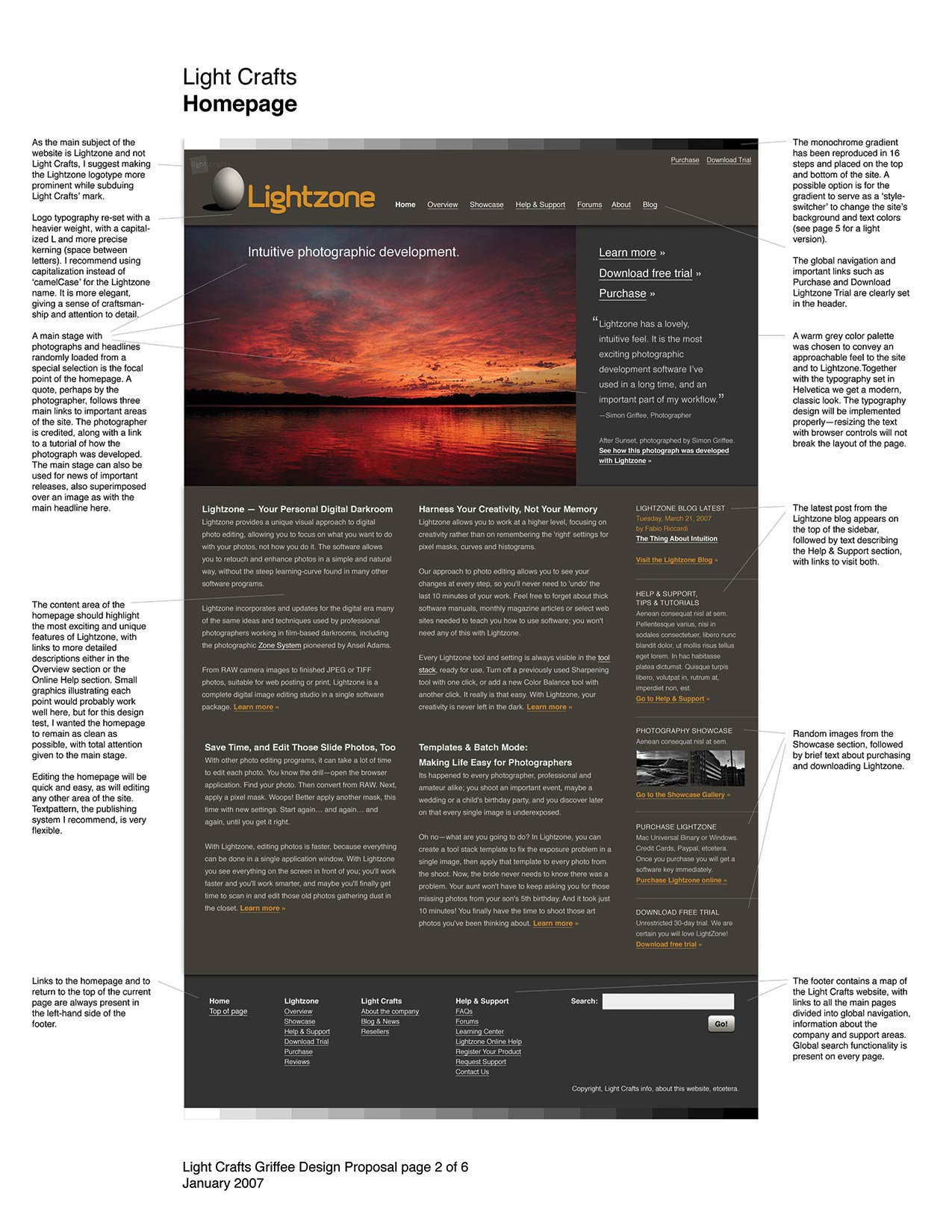
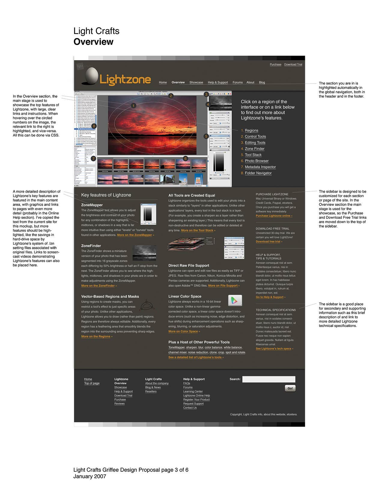
Lightcrafts Photo Editing Software WireframesWireframe Visual Mockups Some wireframes I made for a proposal to redesign the Lighcrafts Lightzone image editing software website. |
|
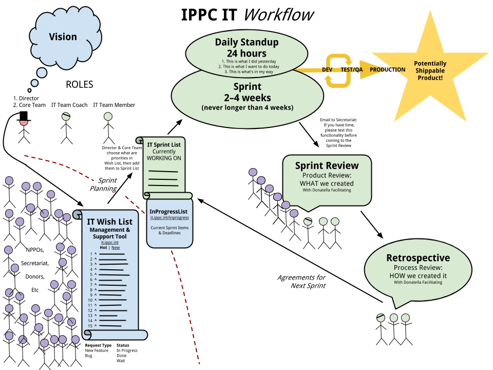
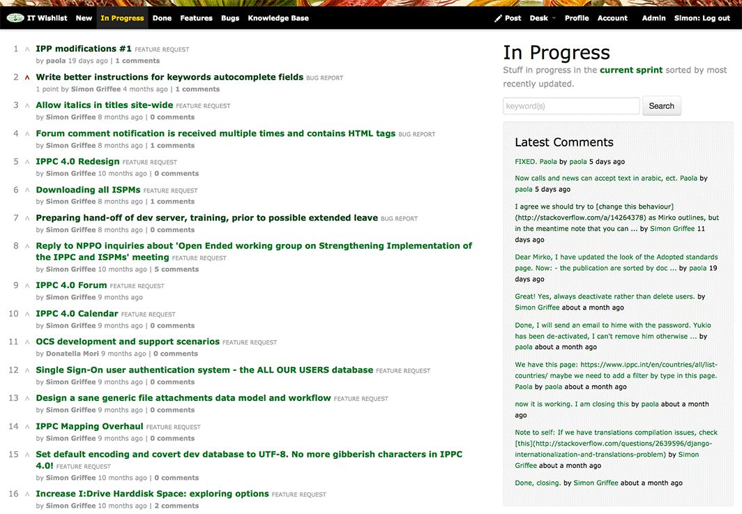
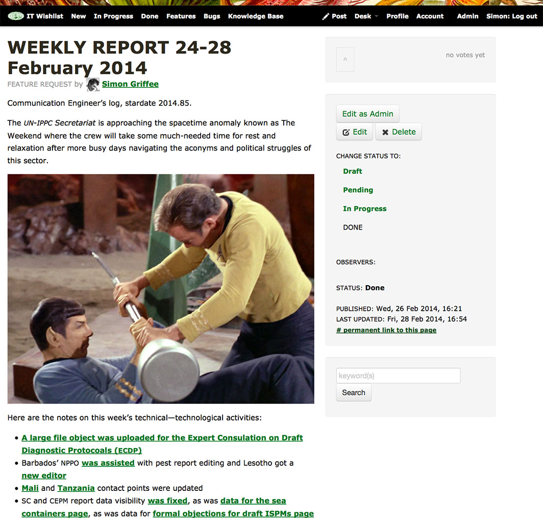
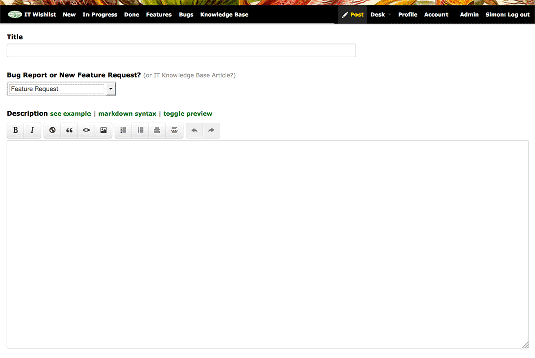
IPPC IT WishlistUser Experience Design, Interaction Design, Back End and Client Side Web Development (Python, Django, HTML, CSS, JavaScript), Graphic Design. ProblemThe International Plant Protection Convention needed to a better way to organize, manage and produce its IT work to better support its mission. SolutionI hacked together a web application where anyone in the team could post a bug report or feature request and also vote on others’ posts, thus creating an agile, organic todo list. In addition, I made:
Work DoneUser experience design, interaction design, web development (Python, Django, HTML, CSS, JavaScript), graphic design. |
|
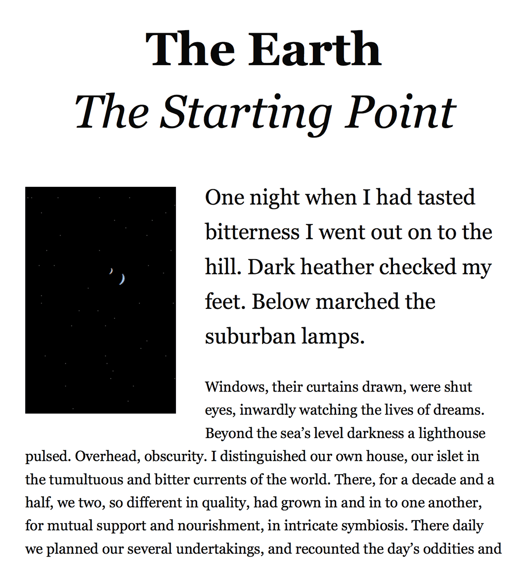
Web Typography TemplateHTML, CSS, Georgia Typeface Good design involves good writing and good typography. To offer the latter to anybody looking to make reading easy on a web browser or a mobile device I made an HTML & CSS template using the first chapter of Olaf Stapledon’s Star Maker as example text. |
ATPM cover designs:
|
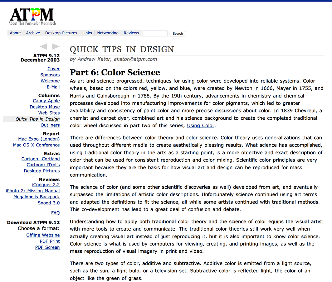
About This Particular MacintoshWebsite design ProblemAbout This Particular Macintosh (ATPM.com) is an online magazine which ATPM’s design needed some refreshment to be brought up to date with modern web design techniques whilst keeping the familiar look and feel. I took the job. SolutionI worked with Michael Tsai and Christopher Turner to create a new CSS-based layout, with more generous whitespace and other graphical refinements. The new layout and semantic markup also reduced the site’s file sizes by almost half. Work DoneGraphic design, HTML markup, CSS. |
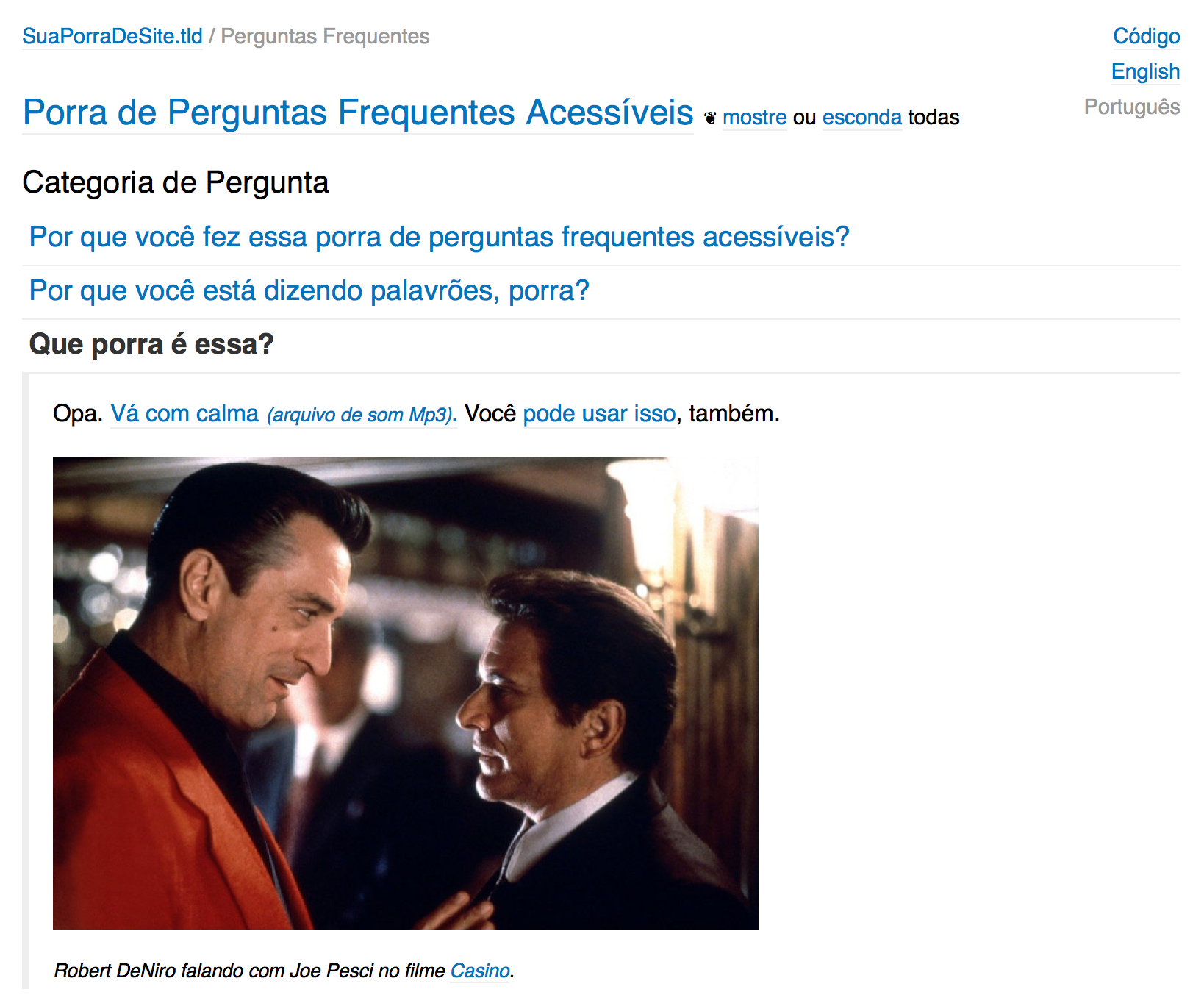
F*!@#$% Accessible FAQWeb page ProblemWhen a question is asked I want to be able to easily select and send a link to an answer located in a single HTML page. The answer should also be visible with JavaScript disabled. SolutionAn accessible FAQ page was created. See an example and the source code. Work DoneHTML, CSS, JavaScript hacking. |
|
|
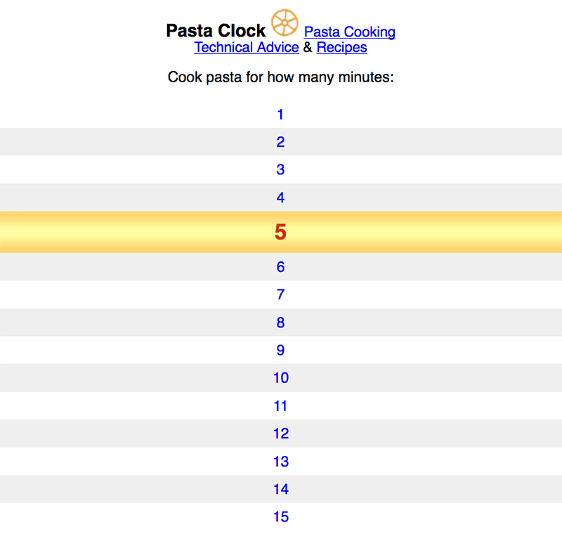
Pasta ClockGraphic design, website and application design, copywriting ProblemOvercooked pasta. SolutionI worked with Jimmy Boss to cobble together a web application that helps everyone cook pasta al dente rather than al mush. Work DoneGraphic design, HTML markup, CSS, JavaScript hacking. Visit application → |
|
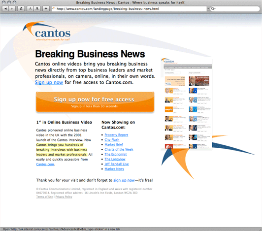
CantosWebsite Design ProblemCantos needed to attract new visitors interested in online business video to their website. An audience accustomed to seeing a great deal of financial information on a daily basis proved to be a challenge. SolutionSimon worked together with a marketer to create a group of clear, modern, accessible HTML landing pages targeted by a focused Google Ad campaign. The landing pages succeeded in bringing a large number of new visitors to explore Cantos’ services with very high impression-to-click rates. Work DoneGraphic design, HTML markup, CSS, CMS templates and implementation. |
|
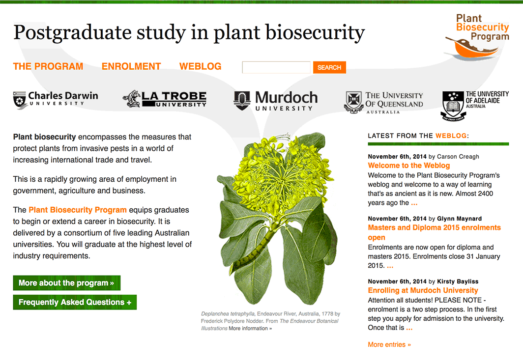
Australian Plant Biosecurity ProgramWebsite Design: Graphic Design, HTML, CSS, JavaScript, CMS, Forum ProblemThe Plant Biosecurity Program of the Australian Government needed a website to promote a postgraduate course in plant biosecurity offered by a consortium of Australian universities. SolutionI created a new design, coded the markup and stylesheets and implemented a CMS for the program staff to update the website as well as a private forum for student discussion. The website art direction uses imagery from The Endeavour Botanical Illustrations online exhibition currently at the Natural History Museum. Work DoneGraphic design, HTML markup, CSS, JavaScript, CMS implementation, User Forum implementation. |
|
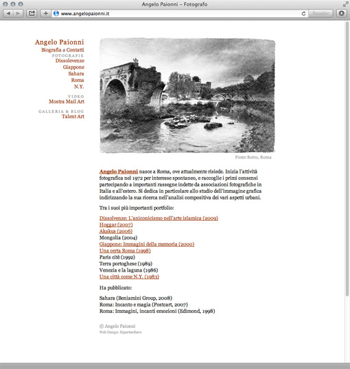
Photographer Angelo PaionniWebsite ProblemA photographer wanted to show his work online. SolutionI created a website. Work DoneGraphic design, web design & development. |
|
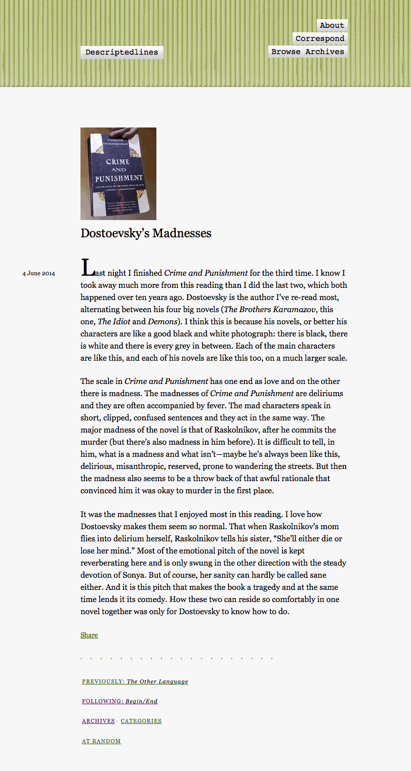
DescriptedlinesWebsite design A writer needed a website to publish her writing, so I made one. |
|
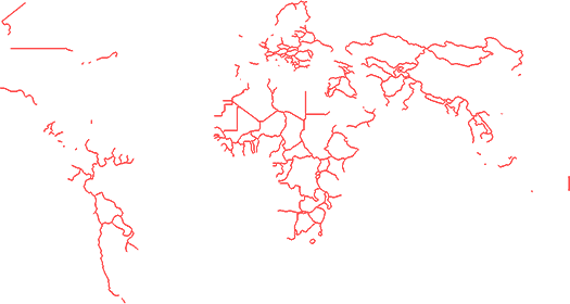
Imaginary LinesWebsite design I was reading a lot of Jiddu Krishnamurti, so I made a website to write and link to things concerning conflict caused by division caused by fear. Borders, nationalism, organized religion and so on. Work DoneGraphic design and web design. |
|
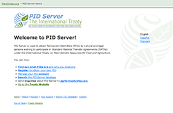
Plant Treaty Internal WebsiteWebsite design ProblemIT Works was working on a website that helps the International Treaty on Plant Genetic Resources for Food and Agriculture (ITPGRFA, phew!) do its job of facilitating the sharing of plant genetic resources among countries around the world. IT Works needed the client-side of the website to be as easy to use as possible for an audience spread across most of the planet using a wide variety of computer systems and of varying computer skills. SolutionI designed the front-end for the ITPGRFA internal website. An easily customizable site was made and built on a foundation of web standards with maximum usability, accessibility and simplicity. This ensured the site was as usable to someone with a modern computer and a DSL connection as to someone with an old machine and a 14400 bit/s modem. Work DoneGraphic design, HTML markup, CSS. |
